About the Project:
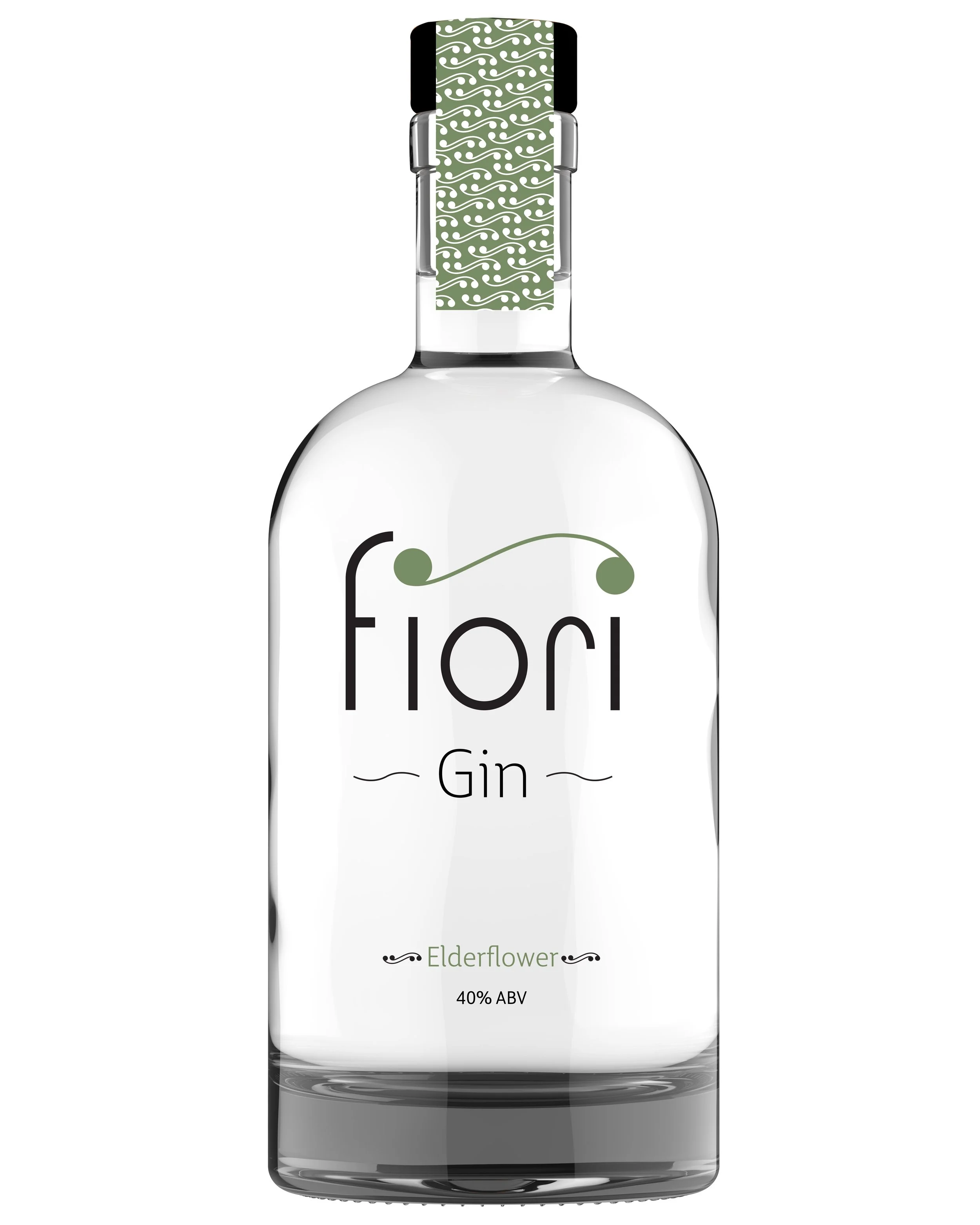
For this project, I was tasked with choosing a liquor (i.e. gin, vodka, whiskey, etc.) and creating a new brand for it. This would primarily focus on the logo, bottle label and design, and any supplementary marketing material. Fiori gin is a nod to the liquor’s heritage of juniper and floral origins. The elegant branding appeals to a sophisticated audience who appreciates the finer things in life.
Approach:
Since gin is primarily made from juniper berries, it seemed only appropriate that I use this element in my design. I also knew that gin originally tended to lean towards floral notes and this is often incorporated into bottle design. Rather than floral visuals, I incorporated this element into the wording and shapes. For this project, I chose to use the Italian word Fiori, meaning flower, as the brand name and logo. The subtle curve ties the two i’s together as a nod to the berries and gives the brand a clean, elegant feel. This is also carried out in the primarily black and white color scheme. I also intentionally chose to use a clear label so that the logo would not feel separated from the clear liquor but rather be visually connected to it.