About the Project:
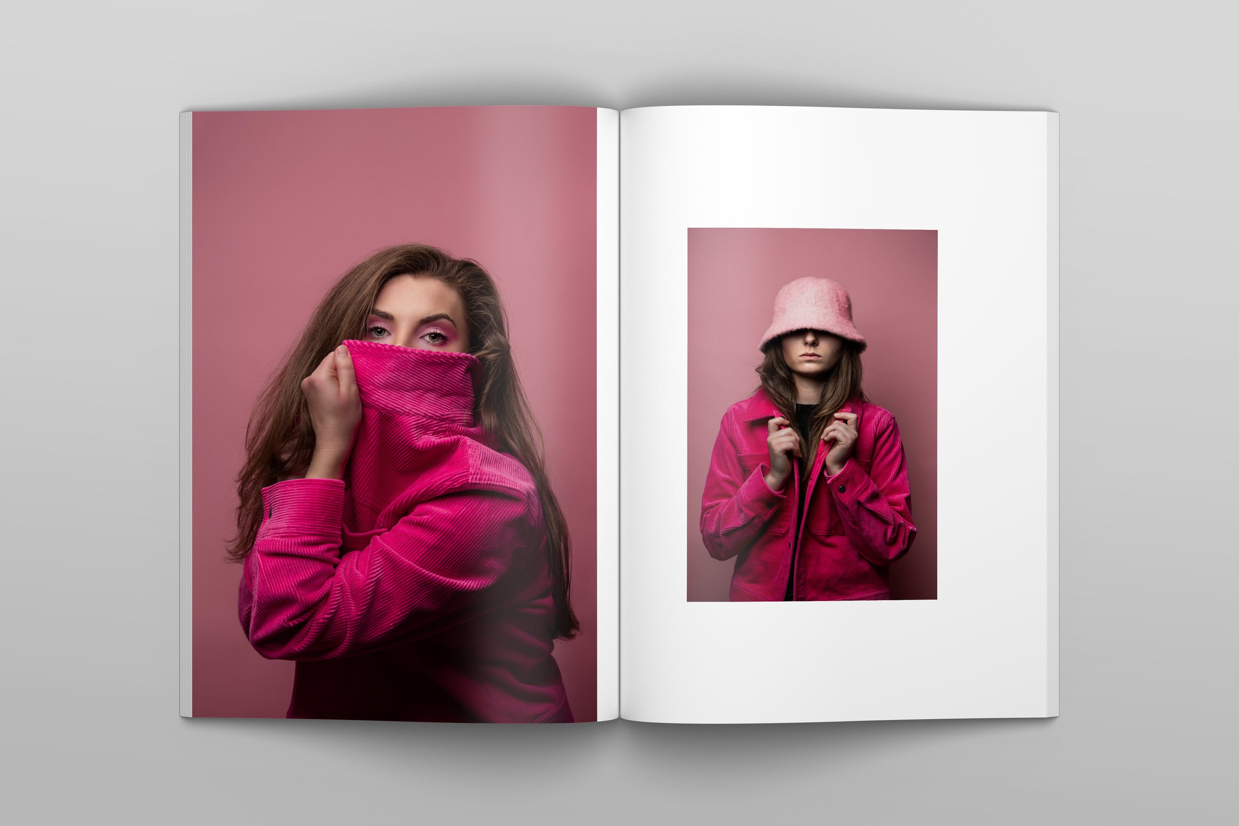
Chromatic Magazine was designed to be the “paper house” for a photography project primarily focused on color. The emphasis was on putting the images front and center with interesting layouts and engaging parings of poses.
Approach:
The goal for this magazine-style book is to bring all the images together in a stunning, high end visual layout. Each composition puts the images as the focus and pairs different poses in a complimentary manner. Several different layouts were used in order to create variety but still allow for some repetition to remain cohesive. Images were paired by color and how the poses visually flowed together. Things such as face direction, angles, negative space, standing, sitting, etc. were considered. White space was also a strong aspect to determine in order to create a harmonious visual instead of an overwhelming photograph or one lost on a page. The name “Chromatic” means relating to or produced by color, which seemed fitting for a color-focused magazine.
Portraits photographed by Rebecca Langlands


